Two weeks ago, I challenged readers to re-create the “after” version of a basic bar chart.
Congratulations to the 9 winners: Molly Hamm, David Napoli, Susan Kistler, Jon Schwabish, Ethan, Mike, Sara Vaca, Samantha Grant, and Kevin Gilds! You’ve officially won bragging rights and a beverage of your choice, my treat, the next time you’re in DC.
Now it’s time to post the how-to guide!
Step 1: Study the chart that you’re trying to reproduce in Excel.
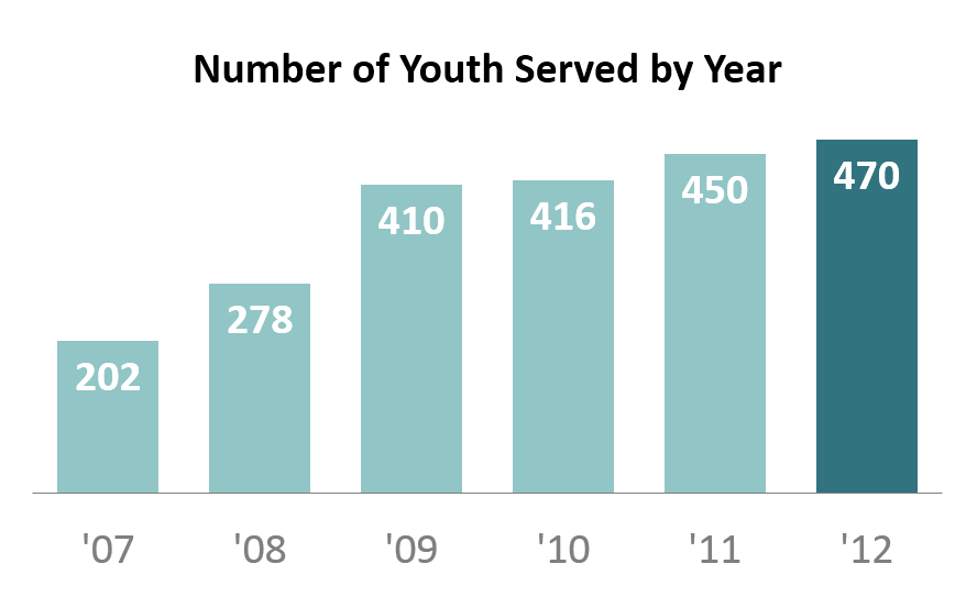
We’re trying to re-create a basic bar chart like the one shown below. We’re examining how a nonprofit has grown over the past six years. This is a simple metric so we don’t need anything more complicated than a basic bar chart.
Step 2: Type your data into Excel.
Here’s how I typed my data into the spreadsheet.
Hot tip for advanced users: I wanted to abbreviate the years (i.e., ’07 instead of 2007). If you type 07, it will turn into 7, because Excel automatically removes zeros at the beginning of numbers. To fool Excel into keeping the zero, you must add an apostrophe; typing ’07 will turn into 07. So, if you want to get ’07 as your final result, you must add two apostrophes; typing ”07 will turn into ’07.

Step 3: Insert a bar chart.
Highlight or select the data table. Go to the Insert tab. Click on the Column icon. Select a 2-D Clustered Column Chart. For additional help with inserting charts, check out this tutorial.
Now we’ve got our default bar chart (shown below). There’s nothing technically wrong with this bar chart. However, with a few small tweaks, we can really improve the formatting.
We’re going to manually adjust 9 settings in Excel: the axis labels, the data labels, the border, the bar color, the font size and color, the gap width, tick marks, the legend, and the grid lines. We’ll go through each of these steps, starting with the axis labels and working around counter-clockwise. These tweaks just take a few seconds each to make. When added together, they can make a big difference.

Step 4: Delete the axis labels.
Click on the axis labels themselves. Then press delete on your keyboard. I do not advocate for removing the axis labels on every chart. This is a matter of personal preference. In this example, the data are so ridiculously straightforward that we really don’t need the axis labels.
 Step 5: Add data labels.
Data labels are the numbers inside the bars that show how many participants were served each year. To position the data labels inside the bars themselves, we need to use a 2-step process. First, right-click on one of the blue bars and select “Add Data Labels.” Second, right-click on one of the labels and select “Format Data Labels.” You’ll get a pop-up screen like the one shown below. You can tweak the label position. In this example, I selected “Inside End.” Then, you can simply click on one of the data labels and change the text color to white. For more help with data labels, watch this tutorial.

Step 6: Remove the border.
Right-click on the border and select “Format Chart Area.” Click on “Border Color” and select “No Line.”
Removing the border is also a personal preference. I started deleting my borders after reading one of Edward Tufte’s books in which he advocates for charts being situated inside and alongside the narrative – rather than sticking charts in the appendix or adding awkward “Figure 1.4″ labels. Border-less charts tend to help the reader’s eyes glide down the pages of your report a little more seamlessly.
Step 7: Adjust the bar color.
This chart was originally designed for an Ignite session. You can view the slides here.
After giving the presentation, there were a few audience questions. One man, with his (first? second? third?) glass of wine in his hand, asked how I selected the turquoise color scheme. He was laughing (with me? at me?) because I was wearing a dark turquoise shirt, a light turquoise blazer, a turquoise necklace, a turquoise bracelet, and turquoise earrings. Yes, even my toenails were painted turquoise. I mumbled something like, “I guess I just really like turquoise!” and promptly ran off the stage. #npfail
The correct answer would’ve been that colors should be used strategically so that the reader’s eyes are naturally drawn to certain patterns in the data. For example, I purposefully drew the reader’s attention to the 2012 bar. The key is to select a plain color (e.g., gray, or light turquoise in this example) and what Stephanie Evergreen calls an action color (e.g., dark turquoise). For examples of plain colors and action colors, check out Stephanie Evergreen’s post on assigning a color system for graphs.
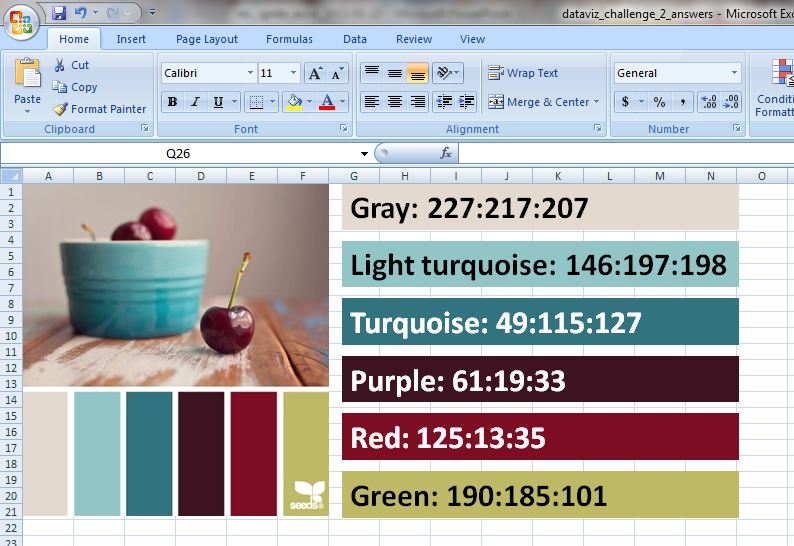
I like to professionalize my charts by tweaking Excel’s default color scheme. During fun projects like this, I select color schemes from Design-Seeds and use the Instant Eyedropper to determine each color’s RGB code. I selected the Cherry Palette for this Ignite presentation (shown below). During real projects, I match colors to the client’s logo.

Sometimes I save my color palette and RGB codes within the Excel workbook itself for safekeeping and easy reference.
So how do you adjust the bar color? Click on one of the bars. Click on the paint can icon. Select “More Colors.” In the pop-up window, select the “Custom” tab. Type in the RGB codes for your plain color and the action color.
Step 8: Adjust the font size and colors.
Here’s another spot where personal preferences come into play. When I’m going to be pasting my chart into a report, I often match my chart’s font to the report (e.g., Calibri size 11, which we typically use for the body text). When I’m going to be pasting my chart into a single, standalone handout, or into a powerpoint slide, I use much larger font sizes (e.g., 14, 16, or 18 point font). When I’m using data labels within the bars (see Step 5), I often use bold font to make the text pop.
Gray can be used strategically to dull-down the least important features of the chart – like the horizontal axis labels (’07, ’08, ’09, ’10, ’11, and ’12).
We’re getting closer! Not there yet…

Step 9: Adjust the gap width.
Gap width is a lesser-known, but very cool, feature of Excel. The gap width is the amount of space between the bars. The default setting on most computers is 150%, which means the distance between the bars is 1.5 times wider than the bar itself.
To adjust gap width, right-click on one of the bars and select “Format Data Series.” In the pop-up window, you can increase or decrease the gap width, as shown below. I often use 50-75% rather than the default 150%.

Hot tip for advanced users: The gap width feature is also very useful for histograms. You can decrease the gap width to 5% so that only a sliver of space remains between the bars.
Step 10: Remove tick marks.
For help with tick marks, watch this tutorial.
Step 11: Remove the legend.
In this simple chart, the legend doesn’t serve any purpose. To remove the legend, simply click on the legend and press the Delete key on your keyboard.
Step 12: Remove the grid lines.
Again, because this chart is so simple, we don’t need the grid lines. For help removing the grid lines, watch this tutorial.
We’re all done! Here’s the finished product.

Step 13: Add a caption (optional).
Charts are inserted into a variety of communications modes: within the body of a report, as a standalone chart that’s printed out and hung on a bulletin board, as a standalone chart that’s printed and used as the handout at a meeting, on a powerpoint slide…
This particular chart was flashed on the screen for 15 seconds during my Ignite session, so there was no need to add a caption. My voice served as the caption.
However, when creating standalone charts, you’ll want to add contextual details so that the reader who passes by your chart on your organization’s bulletin board can quickly grasp the chart’s key takeaway message. One of the best ways of adding contextual details is to add a caption within the Prime Real Estate at the top of the chart. For an example, check out this post by Cole Nussbaumer.
Bonus
I hope this was helpful! Click here to download my Excel file. Thanks again to the dataviz challenge winners, Molly Hamm, David Napoli, Susan Kistler, Jon Schwabish, Ethan, Mike, Sara Vaca, Samantha Grant, and Kevin Gilds!
Discussion Questions
What are your favorite tools for selecting color palettes and determining RGB codes? When do you add captions to your charts, and what are your strategies for selecting the most important findings to emphasize in that caption? Have you adjusted the gap width for any of your charts, and if so, in what situations?

 You are probably aware that car detailing is a crucial part of maintaining your car’s value, but might not understand why it’s so important. We reached out to a car detailer in Oklahoma City to get a better understanding of the process and the benefits from detailing your vehicles. Continue reading to find out more about the significance of car detailing, and get an estimated idea of how often you should be getting your car detailed.