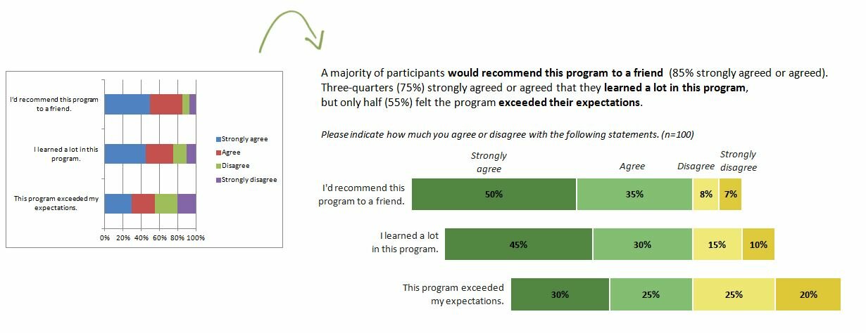
Last week I shared strategies for improving any chart’s colors. One of the examples was a diverging stacked bar chart:

diverging_before-afterI love stacked bar charts because they’re pretty versatile, and because they’re a great chart for lots of evaluation and survey data. In my example, I looked at the percentage of survey respondents who selected strongly agree, agree, disagree, and strongly disagree on a satisfaction survey. But stacked bar charts can be used in dozens of different ways.

So when can you use a stacked bar chart?

  • Stacked bar charts are for part-to-whole relationships. Use them when you want readers to see both a) one portion of the bar and b) compare that piece to the entire bar.
  • Stacked bar charts can be used for tallies or percentages. A tally is the number of actual people, dollars, etc. For example, a nonprofit could display their funding sources in a stacked bar chart – $100K from a foundation, $200K from a government grant, and so on. The reader can see the size of each grant as well as how the grants stack up as a whole.
  • Stacked bar charts can be used for nominal, ordinal, or diverging data. An example of nominal data is the racial/ethnic categories of your survey respondents. Ordinal data has a natural order – from best to worst, most to least, something to nothing – like my example. Diverging data is a subtype of ordinal data – when the categories are polar opposites and there’s a clear middle ground or neutral zone in between two ends.

And when can you use a diverging stacked bar chart? Diverging stacked bar charts are just for comparing several sets of ordinal data at once. They work best when you’ve got an even number of categories (like the 4 survey choices). Then, you can easily line up the midpoints along an invisible y-axis.

The dataviz challenge: Re-create the “after” version in Excel, R, or some other free software program. When you’re finished, email me or tweet a screenshot to @annkemery.

Bonus! 1) Adapt this chart for own data. Think outside the box! 2) There are at least two different ways to create diverging stacked bar charts in Excel. Can you find more than one solution? (And these charts are so awesome that you’ll even see one solution on Stephanie Evergreen’s blog next week!) 3) Don’t forget to use custom colors!

The prize for playing: Beer or coffee, my treat, the next time you’re in DC; a professional development opportunity; and bragging rights.

I’ll post the how-to guide in 3 weeks, on September 6. Happy charting!

Checklist for Focus Group Facilitators

Are you facilitating a focus group? If so, you’ve probably got a lot on your mind – greeting participants, making sure everyone feels comfortable, covering all the key questions… It’s a lot to remember!

As I was learning to facilitate focus groups, I started taking notes of all the good advice I received from experienced facilitators. I turned that advice into a checklist for myself. I  review my checklist before every focus group (to keep the advice fresh on my mind) and after every focus group (as a self-evaluation). You could also use this checklist to assess colleagues who are learning to facilitate focus groups (i.e., use the checklist as a conversation starter when you’re debriefing together after the focus group).

Here’s my checklist for focus group facilitators. Did the facilitator:

  • Introduce him or herself?
  • Explain the purpose of the focus group?
  • Explain the rules for the discussion?
  • Address issues of confidentiality?
  • Use verbal and non-verbal expressions to make participants feel comfortable during the focus group?
  • Facilitate real interaction among group members (not just a series of individual interviews)?
  • Draw everyone into the discussion?
  • Demonstrate genuine interest in the discussion?
  • If asked for their personal opinion on a topic during the group, deflect requests by participants to give an opinion?
  • Maintain a good pace during the discussion (kept things moving but don’t rush questions)?
  • Ask questions in a neutral way (not in a leading way)?
  • Link comments to previous comments or themes?
  • Address comments or behaviors that could take the discussion off course?
  • Address disruptive and disrespectful behavior?
  • Ask participants for validation if rewording or summarizing comments?
  • Court reporting but firmly stop a chatty participant?
  • Demonstrate sensitivity to emotional reactions of participants?
  • Display awareness and respect for cultural issues that emerge in the discussion?
  • Re-explain or re-phrase questions as needed?
  • Sincerely thank participants for contributing?

Do you have additional tips to add to the checklist? Which tips have been most valuable to you when facilitating a focus group?

Note from Ann: Last week I shared a dataviz how-to guide. Paul Denninger has a great alternative solution to share! He uses hidden bars, also known in the Excel community as floating bars or white bars, to build “two” charts in one. Enjoy!

Getting excel to do complex work is easy; making the output look nice is a different matter. I took the challenge to recreate Ann’s graph because I’m always looking for better ways to display information.

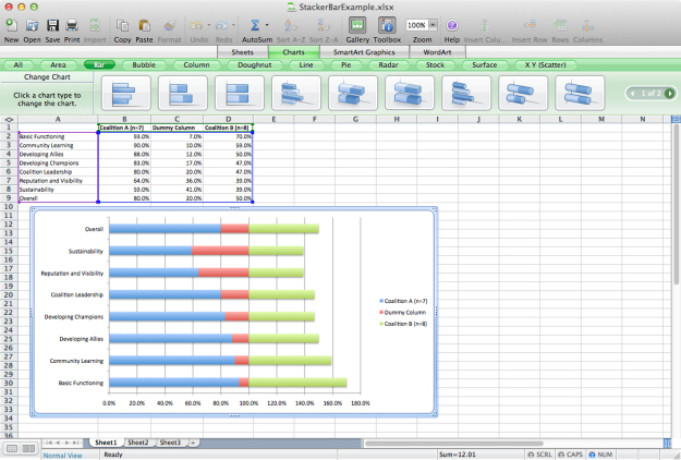
The solution required a stacked bar chart, so the only problem was lining up the starting point for the second dataset. A buffer needed to sit between the end of the first set of bars and the start of the second so that it would force the second set to line up correctly. Hidden data had to fill the gap. Here’s how I did it.

First, start by inputting the original data. Sorting the rows from large to small will help make the chart easier to build.

Original Data

First, input the original data

The next step is creating the dummy data. Insert a column between the two existing datasets and populate it by subtracting the first column from “1.” This gives you a series of percentages that start at the end of the first bar and end at “1.” The problem of lining up the second dataset is solved at this point.

Dummy Column

Create a column of dummy data

With all of the data in place, creating the chart is easy. Use a stacked bar and include all 3 columns.

Setting Chart

Insert a stacked bar chart

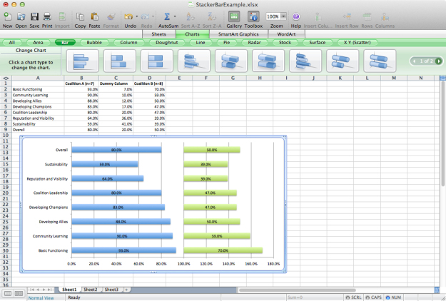
Once the chart has been built, it’s time to hide the dummy column. Highlight the red data series and choose the format menu. Fill the series with the same color as your background. This makes the bars blend into the background and leaves them invisible. Do the same for the data labels. The dummy information is now hidden and your second dataset lines up properly.

Removing Dummy Bars

Make the dummy data invisible

The y-axis still needs to be fixed since the values are organized from low to high. Invert it by highlighting it and opening the format axis menu. Tick the “categories in reverse order” radio button to have the bars arrange themselves from high to low.

Fix the vertical axis

Flip the y-axis

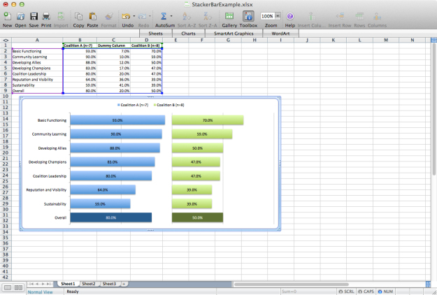
Here is the primary display difference between this solution and Ann’s. Due to the hidden data, the x-axis begins at 0 and goes up to 200%. Since it’s a big challenge to make repeating axes in one chart, and one that I haven’t solved, it’s probably best to remove the x-axis altogether. Since the data values are shown in the bars, removing the axis should not make data interpretation more difficult. In fact, it will be easier for people looking at the chart since they don’t have to rescale the second data series in their heads.

Finally, decrease the gap between the bars and invert the fill and text colors for the overall bar. This makes it stand out from the other series. It’s personal preference whether you want to make the data labels bold or not.

Expand, invert the colors and remove the x-axis

Expand, invert the colors and remove the x-axis

Your chart is finished and you have improved on excel’s built in data presentation immensely. Other than the problem with the x-axis, this solution gives the same result as Ann’s. It’s a visually appealing way to compare two or more groups across the same categories.

When he isn’t playing with Excel and learning to use R better, Paul Denninger is trying to start a company. He currently manages investments for people and is on a constant search for data to analyze. He spends enough time working with nonprofits that he might make a career change and do it full time. You can see more of his work on his blog, Risk Assets.

Two weeks ago, I challenged readers to re-create the “after” version of a side by side bar chart. You can read the full post here.

Congratulations to the 9 contestants! Click on the contestant’s name to see their chart.

  • Regan Grandy
  • Sara Vaca
  • Alex Kadis
  • Katrina Brewsaugh
  • @CaptainCane64
  • @PD_ssp
  • Will Fenn
  • Angie Ficek (Check out how she used her own data!)
  • James Coyle (Check out how he used his own pre-post data!)

Now it’s time to post the how-to guide.

Step 1: Study the chart that you’re trying to reproduce in Excel.

We’re trying to re-create a side by side bar chart like the one shown below. We’re comparing how Coalition A and Coalition B scored on Innovation Network’s Coalition Assessment Tool.

sidebysidebarchart

Step 2: And the secret to making side by side bar charts in Excel…

…is that we’re going to make two separate bar charts, one for Coalition A and one for Coalition B. When we copy and paste the charts from Excel into PowerPoint or Word, they’ll look like a single cohesive chart.

finished_product

Step 3: Type the data into Excel.

Make sure you choose a purposeful order to your data, like the highest percentage on top and the lowest percentage on bottom.

Excel often flips the data table upside down when creating charts, i.e. if you want the overall scores to be at the bottom of the chart, then you need to put the overall scores in the top of your data table. (Or, you can reverse the order of the categories later on.)

step3

Step 4: Create the first bar chart.

You know the drill: Add data labels inside the end of your bars. Choose a color palette that matches your client’s logo or your own logo. Use an action color to draw the reader’s eye where you want it (in my example, the overall score). Delete unnecessary ink like the tick marks, grid lines, and border. Use gray to de-emphasize things like (n=7) and the axis labels. Reduce the gap width.

step4

Beginner Excel users: If you need extra instruction, check out how to make a basic bar chart and my Excel for Evaluation chart tutorials.

Step 5: Copy the first chart.

Rather than re-create the wheel when making the second bar chart, let’s save some time by simply copying the first chart.

step5

Step 6: Populate the second chart with Coalition B’s data.

Use the “select data” feature to put Coalition B’s percentages into the chart.

step6

Step 7: Adjust the second chart’s bar color and title.

step7

Step 8: Delete the second chart’s axis labels.

Yep, you’re right, the second chart’s bars are going to get waaaaaay too long. We’ll fix this in Step 9.

step8

Step 9: Re-size the second chart.

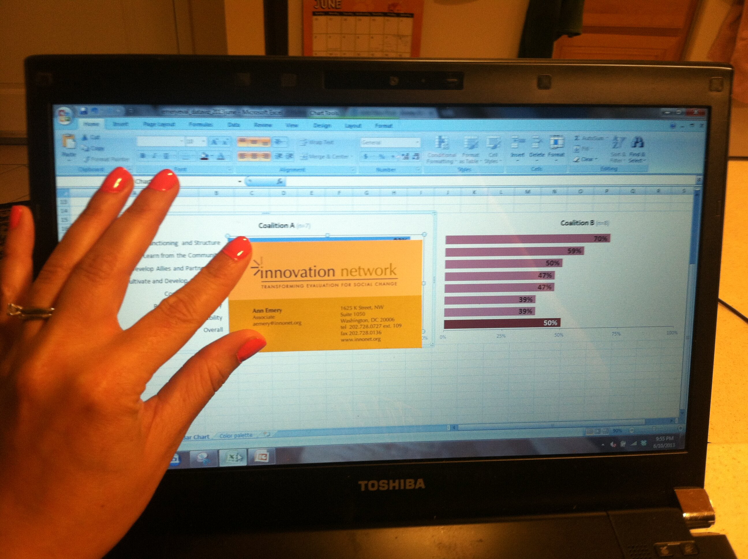
Here’s my super scientific secret for making sure each chart is the same size: I measure the plot area with a business card.

First, adjust the first chart's plot area so that it's the width of a business card or post-it note.

First, adjust the first chart’s plot area so that it’s the width of a business card or post-it note.

Next, I adjust the second chart's plot area so that it's the same width as my business card.

Next, I adjust the second chart’s plot area so that it’s the same width as my business card.

Step 10: Paste the charts into PowerPoint or Word.

Select both charts and paste them into PowerPoint or Word at the same time. Here’s what it looks like on a slide. Looks like a single chart!

step10

Thanks to everyone who participated in the first and second dataviz challenges! I hope these challenges give you a chance to practice and build upon your Excel and visualization skills.

Last time, we made a streamlined version of the basic bar chart by adjusting Excel’s default settings. Basic bar charts are great when you’re just looking at simple patterns, like one series of data at a time.

However, sometimes we need to compare several series of data at one time. For example, the Innovation Network team and I recently compared the capacity of 12 different coalitions using our coalition assessment tool. We calculated coalition capacity in 7 different areas, such as Basic Functioning and Structure and the Ability to Cultivate and Develop Champions. To learn more about the tool, check out some materials from a recent presentation here.

The “before” chart: Here’s a clustered (aka cluttered) bar chart based on fictional data from the coalition assessment tool. The default Excel chart to compare Coalition A and Coalition B might look something like this:

default1

A default clustered bar chart in Excel. Bleh.

Or, you could use the switch row/column feature to make a default chart like this:

default2

Another default clustered bar chart in Excel.

These default clustered bar charts work… kind of. Well… not really. Actually, no, they really don’t work at all! My brain needs a couple minutes to read the default charts and really think about comparisons.

The “after” chart: Luckily, with a little Excel elbow grease, we can make the patterns pop out even faster. Here’s a side by side bar chart:

sidebysidebarchart

Now, my brain can see the patterns almost immediately: Both coalitions scored highest on Basic Functioning and Structure. Both coalitions scored lowest on Sustainability, with Reputation and Visibility scoring pretty low as well. Coalition A scored higher than Coalition B on every section of the assessment. The overall scores were 80% for Coalition A and 50% for Coalition B. Phew! This is much easier for my brain.

The dataviz challenge: Re-create the “after” version of the side by side bar chart in Excel, R, or some other free software program. When you’re finished, email me or tweet a screenshot to @annkemery.

Tips for beginner Excel users: First, learn how to make a basic bar chart. Then, check out this powerpoint for tips on making a side by side bar chart.

Bonus for advanced Excel users: Instead of copying this dataset exactly, think about how you might use a side by side bar chart in your own work. Can you re-create this chart using your own data or your own color scheme?

The prize for playing: Beer or coffee, my treat, the next time you’re in DC; a professional development opportunity; and bragging rights.

I’ll post the how-to guide in two weeks, on June 10, 2013. Happy charting!

Two weeks ago, I challenged readers to re-create the “after” version of a basic bar chart.

Congratulations to the 9 winners: Molly Hamm, David Napoli, Susan Kistler, Jon Schwabish, Ethan, Mike, Sara Vaca, Samantha Grant, and Kevin Gilds! You’ve officially won bragging rights and a beverage of your choice, my treat, the next time you’re in DC.

Now it’s time to post the how-to guide!

Step 1: Study the chart that you’re trying to reproduce in Excel.

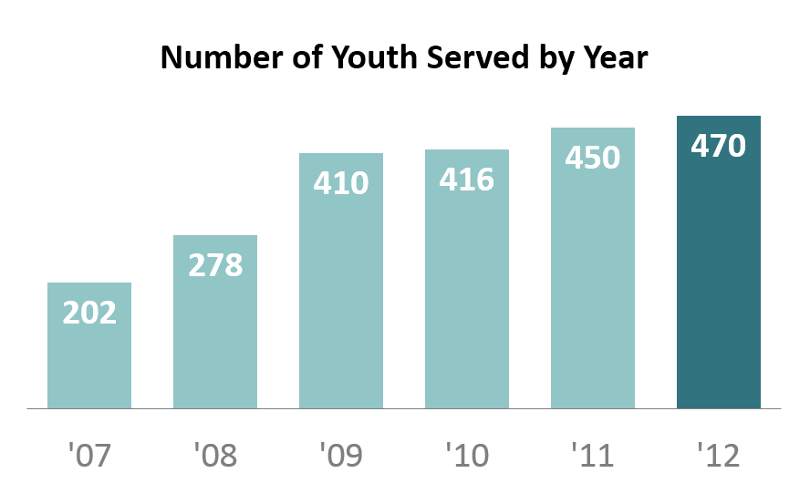
We’re trying to re-create a basic bar chart like the one shown below. We’re examining how a nonprofit has grown over the past six years. This is a simple metric so we don’t need anything more complicated than a basic bar chart.
basic_bar_chart_step1

Step 2: Type your data into Excel.

Here’s how I typed my data into the spreadsheet.

Hot tip for advanced users: I wanted to abbreviate the years (i.e., ’07 instead of 2007). If you type 07, it will turn into 7, because Excel automatically removes zeros at the beginning of numbers. To fool Excel into keeping the zero, you must add an apostrophe; typing ’07 will turn into 07. So, if you want to get ’07 as your final result, you must add two apostrophes; typing ”07 will turn into ’07.

step2_bonus

Step 3: Insert a bar chart.

Highlight or select the data table. Go to the Insert tab. Click on the Column icon. Select a 2-D Clustered Column Chart. For additional help with inserting charts, check out this tutorial.

Now we’ve got our default bar chart (shown below). There’s nothing technically wrong with this bar chart. However, with a few small tweaks, we can really improve the formatting.

We’re going to manually adjust 9 settings in Excel: the axis labels, the data labels, the border, the bar color, the font size and color, the gap width, tick marks, the legend, and the grid lines. We’ll go through each of these steps, starting with the axis labels and working around counter-clockwise. These tweaks just take a few seconds each to make. When added together, they can make a big difference.

basic_bar_chart_step3b

Step 4: Delete the axis labels.

Click on the axis labels themselves. Then press delete on your keyboard. I do not advocate for removing the axis labels on every chart. This is a matter of personal preference. In this example, the data are so ridiculously straightforward that we really don’t need the axis labels.

step4Step 5: Add data labels.

Data labels are the numbers inside the bars that show how many participants were served each year. To position the data labels inside the bars themselves, we need to use a 2-step process. First, right-click on one of the blue bars and select “Add Data Labels.” Second, right-click on one of the labels and select “Format Data Labels.” You’ll get a pop-up screen like the one shown below. You can tweak the label position. In this example, I selected “Inside End.” Then, you can simply click on one of the data labels and change the text color to white. For more help with data labels, watch this tutorial.

step5

Step 6: Remove the border.

Right-click on the border and select “Format Chart Area.” Click on “Border Color” and select “No Line.”

Removing the border is also a personal preference. I started deleting my borders after reading one of Edward Tufte’s books in which he advocates for charts being situated inside and alongside the narrative – rather than sticking charts in the appendix or adding awkward “Figure 1.4″ labels. Border-less charts tend to help the reader’s eyes glide down the pages of your report a little more seamlessly.

Step 7: Adjust the bar color.

This chart was originally designed for an Ignite session. You can view the slides here.

After giving the presentation, there were a few audience questions. One man, with his (first? second? third?) glass of wine in his hand, asked how I selected the turquoise color scheme. He was laughing (with me? at me?) because I was wearing a dark turquoise shirt, a light turquoise blazer, a turquoise necklace, a turquoise bracelet, and turquoise earrings. Yes, even my toenails were painted turquoise. I mumbled something like, “I guess I just really like turquoise!” and promptly ran off the stage. #npfail

The correct answer would’ve been that colors should be used strategically so that the reader’s eyes are naturally drawn to certain patterns in the data. For example, I purposefully drew the reader’s attention to the 2012 bar. The key is to select a plain color (e.g., gray, or light turquoise in this example) and what Stephanie Evergreen calls an action color (e.g., dark turquoise). For examples of plain colors and action colors, check out Stephanie Evergreen’s post on assigning a color system for graphs.

I like to professionalize my charts by tweaking Excel’s default color scheme. During fun projects like this, I select color schemes from Design-Seeds and use the Instant Eyedropper to determine each color’s RGB code. I selected the Cherry Palette for this Ignite presentation (shown below). During real projects, I match colors to the client’s logo.

step7

Sometimes I save my color palette and RGB codes within the Excel workbook itself for safekeeping and easy reference.

So how do you adjust the bar color? Click on one of the bars. Click on the paint can icon. Select “More Colors.” In the pop-up window, select the “Custom” tab. Type in the RGB codes for your plain color and the action color.

Step 8: Adjust the font size and colors.

Here’s another spot where personal preferences come into play. When I’m going to be pasting my chart into a report, I often match my chart’s font to the report (e.g., Calibri size 11, which we typically use for the body text). When I’m going to be pasting my chart into a single, standalone handout, or into a powerpoint slide, I use much larger font sizes (e.g., 14, 16, or 18 point font). When I’m using data labels within the bars (see Step 5), I often use bold font to make the text pop.

Gray can be used strategically to dull-down the least important features of the chart – like the horizontal axis labels (’07, ’08, ’09, ’10, ’11, and ’12).

We’re getting closer! Not there yet…

step8

Step 9: Adjust the gap width.

Gap width is a lesser-known, but very cool, feature of Excel. The gap width is the amount of space between the bars. The default setting on most computers is 150%, which means the distance between the bars is 1.5 times wider than the bar itself.

To adjust gap width, right-click on one of the bars and select “Format Data Series.” In the pop-up window, you can increase or decrease the gap width, as shown below. I often use 50-75% rather than the default 150%.

step9

Hot tip for advanced users: The gap width feature is also very useful for histograms. You can decrease the gap width to 5% so that only a sliver of space remains between the bars.

Step 10: Remove tick marks.

For help with tick marks, watch this tutorial.

Step 11: Remove the legend.

In this simple chart, the legend doesn’t serve any purpose. To remove the legend, simply click on the legend and press the Delete key on your keyboard.

Step 12: Remove the grid lines.

Again, because this chart is so simple, we don’t need the grid lines. For help removing the grid lines, watch this tutorial.

We’re all done! Here’s the finished product.

step12

Step 13: Add a caption (optional).

Charts are inserted into a variety of communications modes: within the body of a report, as a standalone chart that’s printed out and hung on a bulletin board, as a standalone chart that’s printed and used as the handout at a meeting, on a powerpoint slide…

This particular chart was flashed on the screen for 15 seconds during my Ignite session, so there was no need to add a caption. My voice served as the caption.

However, when creating standalone charts, you’ll want to add contextual details so that the reader who passes by your chart on your organization’s bulletin board can quickly grasp the chart’s key takeaway message. One of the best ways of adding contextual details is to add a caption within the Prime Real Estate at the top of the chart. For an example, check out this post by Cole Nussbaumer.

Bonus

I hope this was helpful! Click here to download my Excel file. Thanks again to the dataviz challenge winners, Molly Hamm, David Napoli, Susan Kistler, Jon Schwabish, Ethan, Mike, Sara Vaca, Samantha Grant, and Kevin Gilds!

Discussion Questions

What are your favorite tools for selecting color palettes and determining RGB codes? When do you add captions to your charts, and what are your strategies for selecting the most important findings to emphasize in that caption? Have you adjusted the gap width for any of your charts, and if so, in what situations?